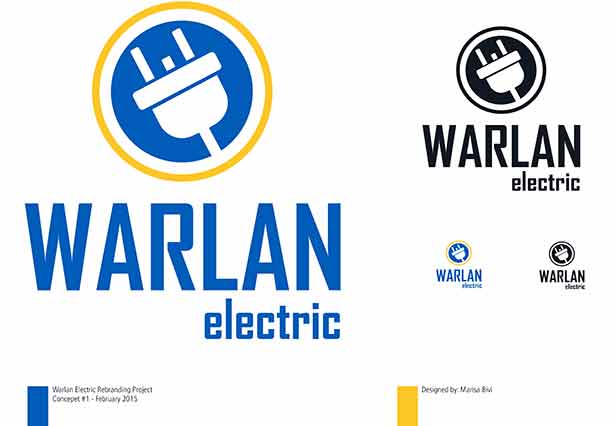
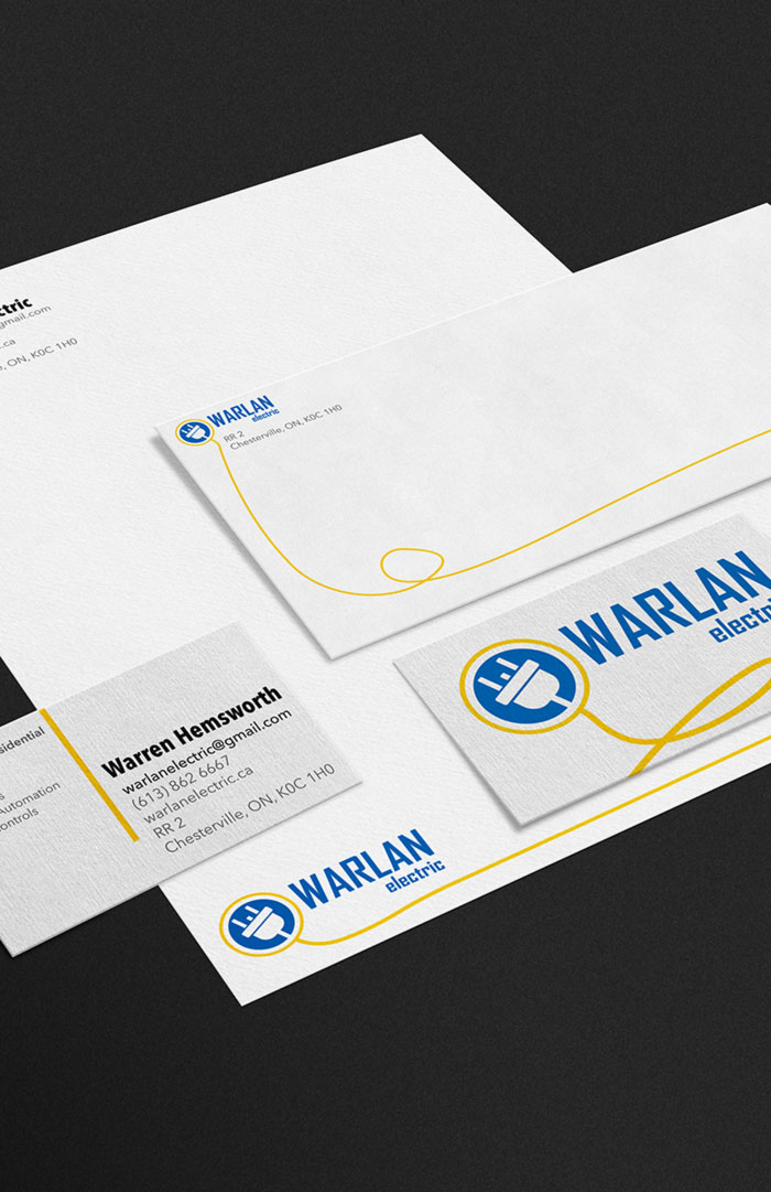
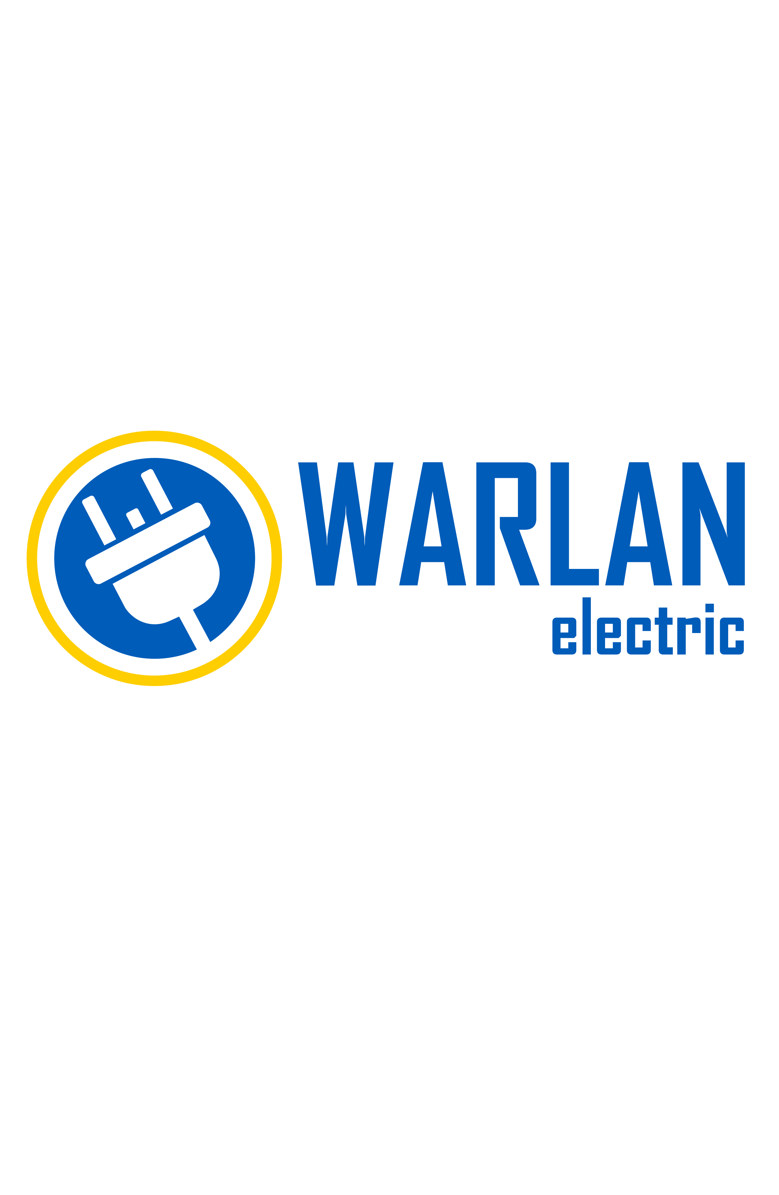
Warlan Logo
Branding | Promotion 2015
Warlan Electric is a new company in the feild of electrical work, specializing in comercial work but also well suited for residential. The work they do on site is all very clean and precise.
Challenge
The new logo needed to represent the company to both commercial clients, who know more about the feild, and residential clients, who aren't as knowledgeable. It was also requested new colours be tried in the logo such as gold or brown.
Solution
The best way to ensure this logo spoke to both possible clients this company has was to simplify the orignal logo and stay away from symbols that only people well versed in the eletrical lingo could understand. The selected font worked well with the symbol half of the logo but also well suited to the companies atmoshpere. The orginal blue from the previous design worked quite well with yellow added in.